Go Edit Pilipinas One – Studio Feel | Photo Manipulation
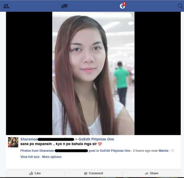
Ok, I got a request from a pretty lady in our FB group. And I was thinking of what should be the final outcome since she didn’t specify what she wants. So I decided to make a Studio Feel Tutorial as I grant her request.
First of all, I don’t want to do too much, it may ruin or cover out her pretty face. So, I just thought that I would just create a Studio feel look.. as if it was an actual photoshoot in studio. Several things can be seen, first of all, the background, it’s very distracting especially the walking guy, and also the lights.
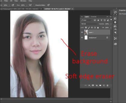
Step 1: Erase the background
To make it have the studio feel we want, the background should be erased.. In this case, I used a soft edged eraser. This gives the effect of white light covering the whole portrait. I don’t need to be detailed since I want lights spilling over Sharamae.
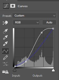
Step 2: Color correction with Curves
Next, we have to adjust the color. If you look at the picture, it looks very flat. So I want it to have more dramatic effect. So, If you look down the layers tab, we can see the Adjustment layer there. We click that and choose Curves. This is a NON-DESTRUCTIVE color correction, so we can go back anytime to change or just delete the layer without affecting the image itself. Adjusted the curve, so that the shadows look darker and the lighter parts become lighter. I also curved down the Blue channel to give that yellowish color, to give it a dreamy feel.
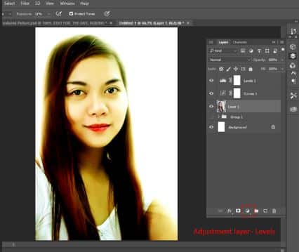
Step 3: Color correction with Levels
Since I want to adjust more the contrast of the picture. I add another adjustment layer, this time, the Levels. Again for non-destructive editing, we will use the Levels on the Layers tab. I adjusted it so that the dark colors, become darker, without affecting the over all color of the portrait.
Step 4: Add some Lens Flare
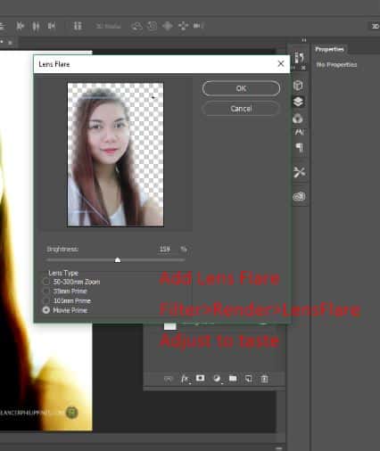
There’s nothing much I want to do at this point since, I have already the look and feel I want, so I’ll just add a tiny flash of a lens flare. We can see the lens flare at Filter>Render>LensFlare. I adjusted it, so that it wont make a lot of noise and preserve her beauty. At this point I set it at Movie Prime option with Brightness at 159% and put it at the upper right hand of the portrait, since there is where the apparent light is coming from.
Step 5: Final touches, add logos and name
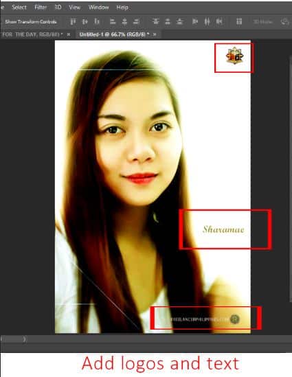
This portrait is already finished. I just added more adjustments, like sharpening the eye, some more adjusting the shadows with Color Burn tool. And finally, since there are a lot of space on the right side, I put everything there, the GoEditPilipinasOne logo, my logo and her name.
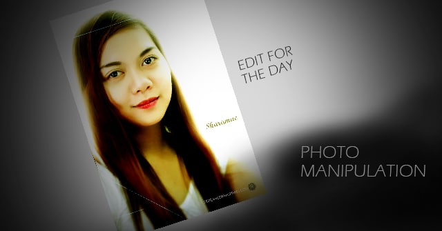
Here’s the final portrait, another photo manipulation practice, from the GoEditPilipinas Group. A studio feel from a mall selfie photo. Hope you like it guys. Please leave a comment below, if you like it, you can share it to the world, thanks for visiting my blog. Subscribe so you’ll get updates as soon as I upload another photo manipulation tutorial!

